Capital Ideas
As the lead UX designer at Group SJR, I helped redesign the content site for Capital Ideas from Capital Group in 2016. A home for daily finance news and business insights.
MY ROLE
User Experience Designer
User Testing
Research and prototype
User Testing
Research and prototype
THE CLIENT
Capital Group is an American financial services company, it ranks among the world’s oldest and largest investment management organizations

Ideation and research
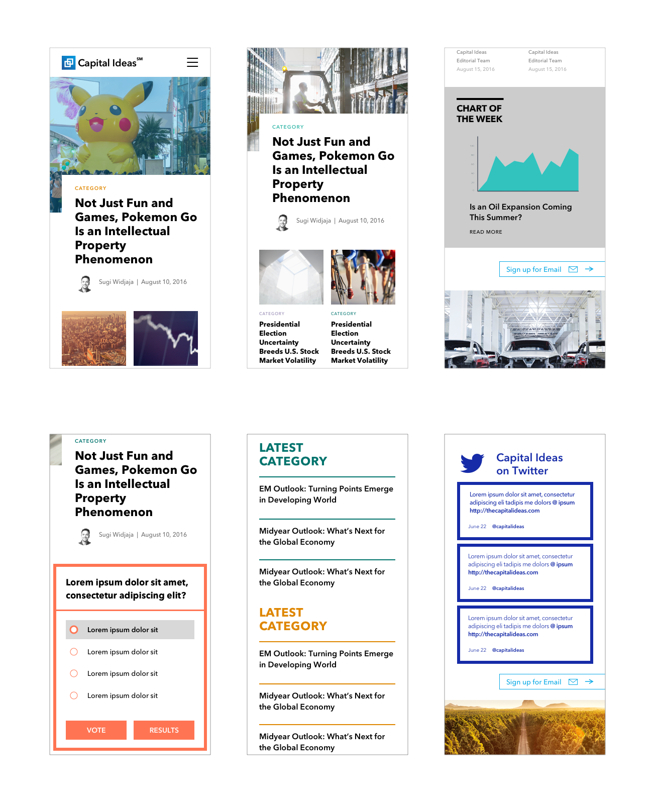
I designed a responsive content site which provides a digital brand experience that is essentially different from existing competitors. In addition, the site navigation was improved to be more user friendly for users to find and share the content.
And for article page, I designed several types of article layout to provide image/video treatment that help the site feel less generic, and had the flexibility to make adjustment in the CMS for the editorial team.
Possible Userflow
![]()
In my work, I always start with 3 questions to help client to think broadly and improve user experience to make users to take the right action we want them to take -
1. What is working on current site?
2. What can be improved?
3. What's our next steps?
In order to answer these questions, I worked with account lead and creative team from SJR, and I also did a heuristic evaluation to clarify problems.
OLD Capital Ideas Homepage
![]()
And for article page, I designed several types of article layout to provide image/video treatment that help the site feel less generic, and had the flexibility to make adjustment in the CMS for the editorial team.
Possible Userflow

In my work, I always start with 3 questions to help client to think broadly and improve user experience to make users to take the right action we want them to take -
1. What is working on current site?
2. What can be improved?
3. What's our next steps?
In order to answer these questions, I worked with account lead and creative team from SJR, and I also did a heuristic evaluation to clarify problems.
OLD Capital Ideas Homepage

WHAT THE CLIENT WANTS:
1.
Move away from a site that feels strictly corporate to an editorial magazine style
2.
Bring Capital Group editors/managers forward to help humanize the brand
3.
More email signups
-
We need to improve the CTA
Wireframes
01 Homepage
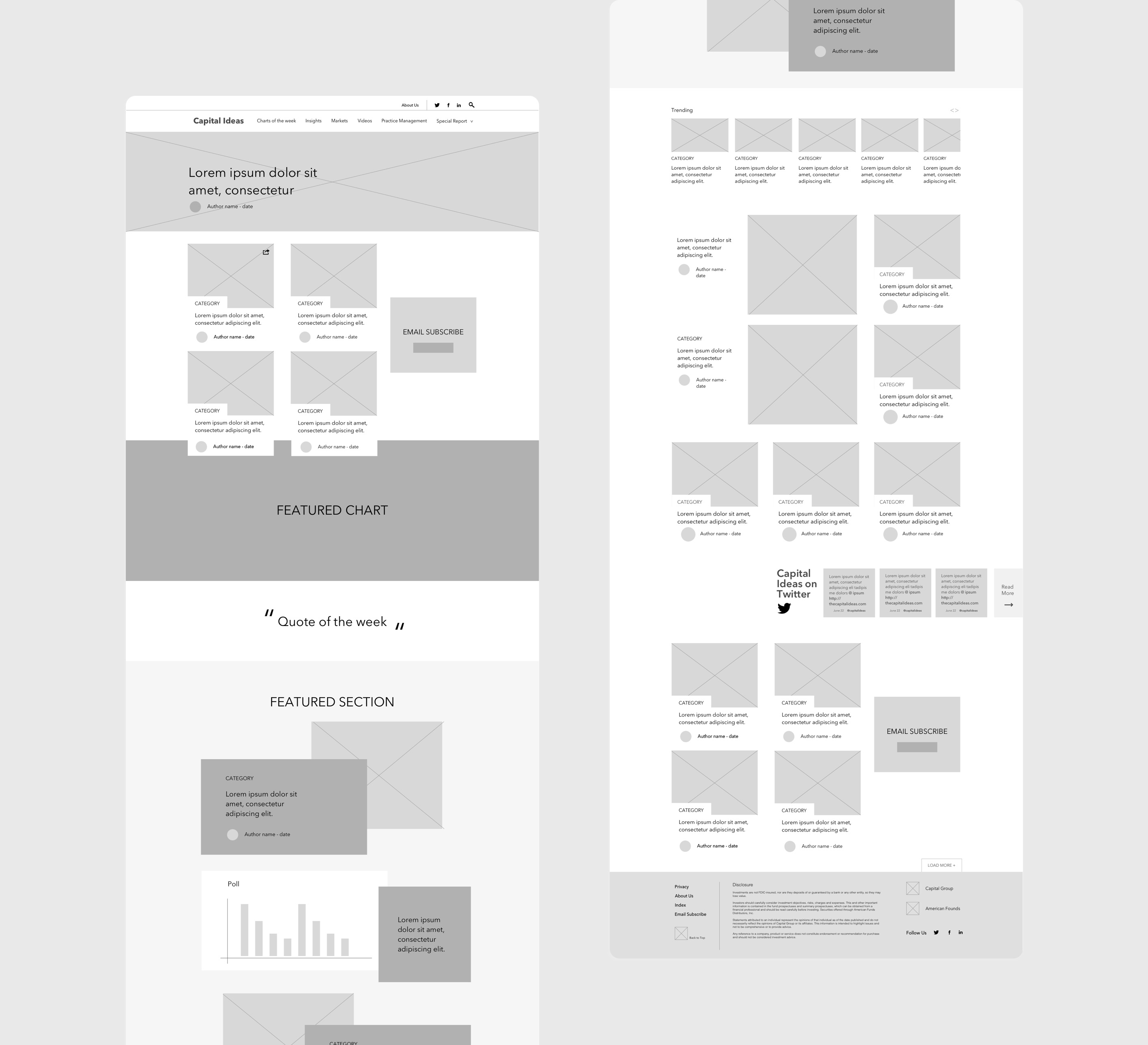
On pervious homepage, we don't have an easy and inviting navigation for user to find the desired content. Therefore I designed a partially sticky navigation on the top - when user scroll down it will disappear, and when user scroll up it shows up and stays.
For content layout, I created a hero article with dynamic list of articles with visual hierarchy. Featured chart and social feed on the homepage giving it an modern personality. Also adding author byline to show humanization.


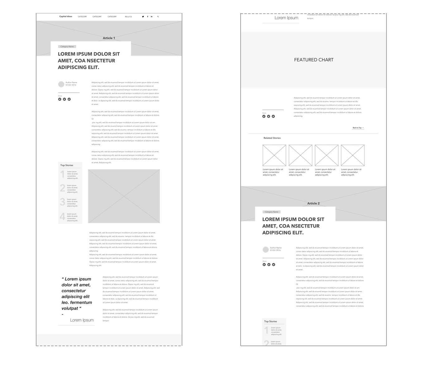
02 Article Page : Flexible template for any content
It was a big challenge for us to have multiple templates for different article type - we have to keep different modules in same grid system for better responsive design and UX, also we don't want the article page to be inflexible with a boring look. I started from listing out modules we need for article page and did several different layout to find the best solution for Capital Ideas article page.

Final Product

Takeaways
After we handed off all the designs to SJR dev team, we finally launched it on January 06, 2017.
Here are four achievements I want to share with you:
- I made 30 pages of wireframe including desktop(HD), small screen/tablet and mobile.
- I designed the whole new reading experience for Capital Ideas which moved away from a site that feels strictly corporate to an editorial magazine style
- Created a new interactive About page, brought Capital Group editors/managers forward to help humanize the brand